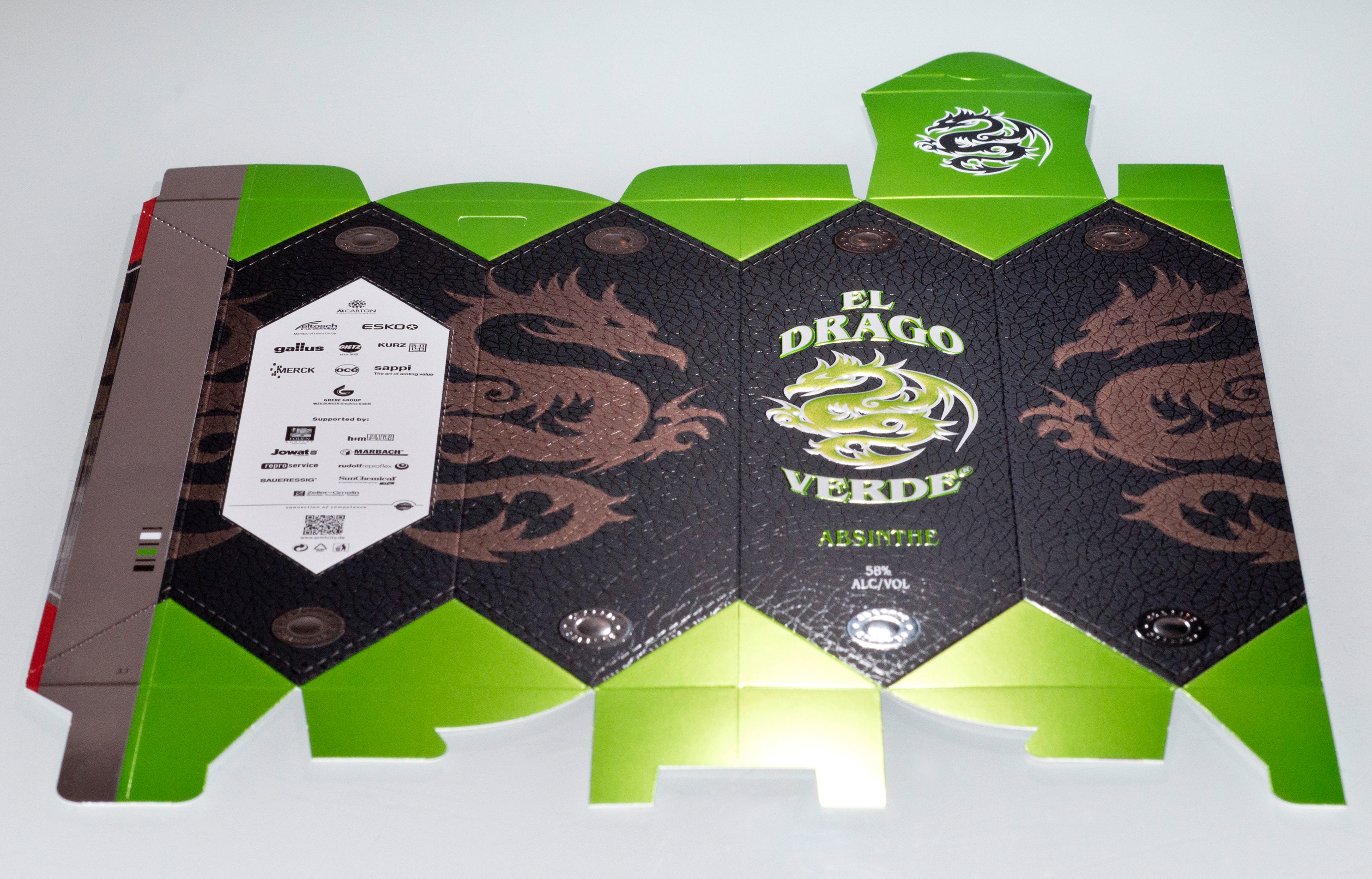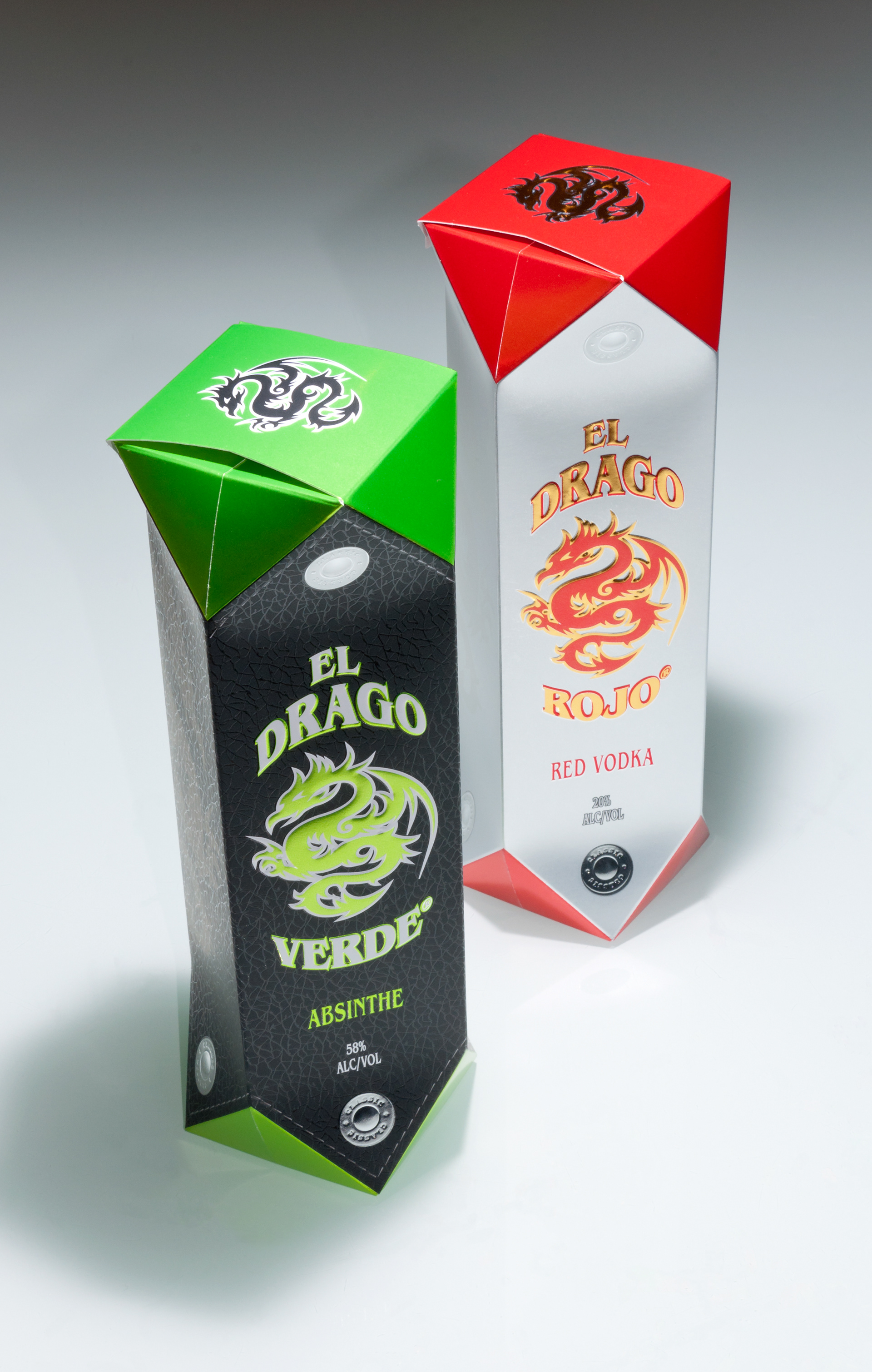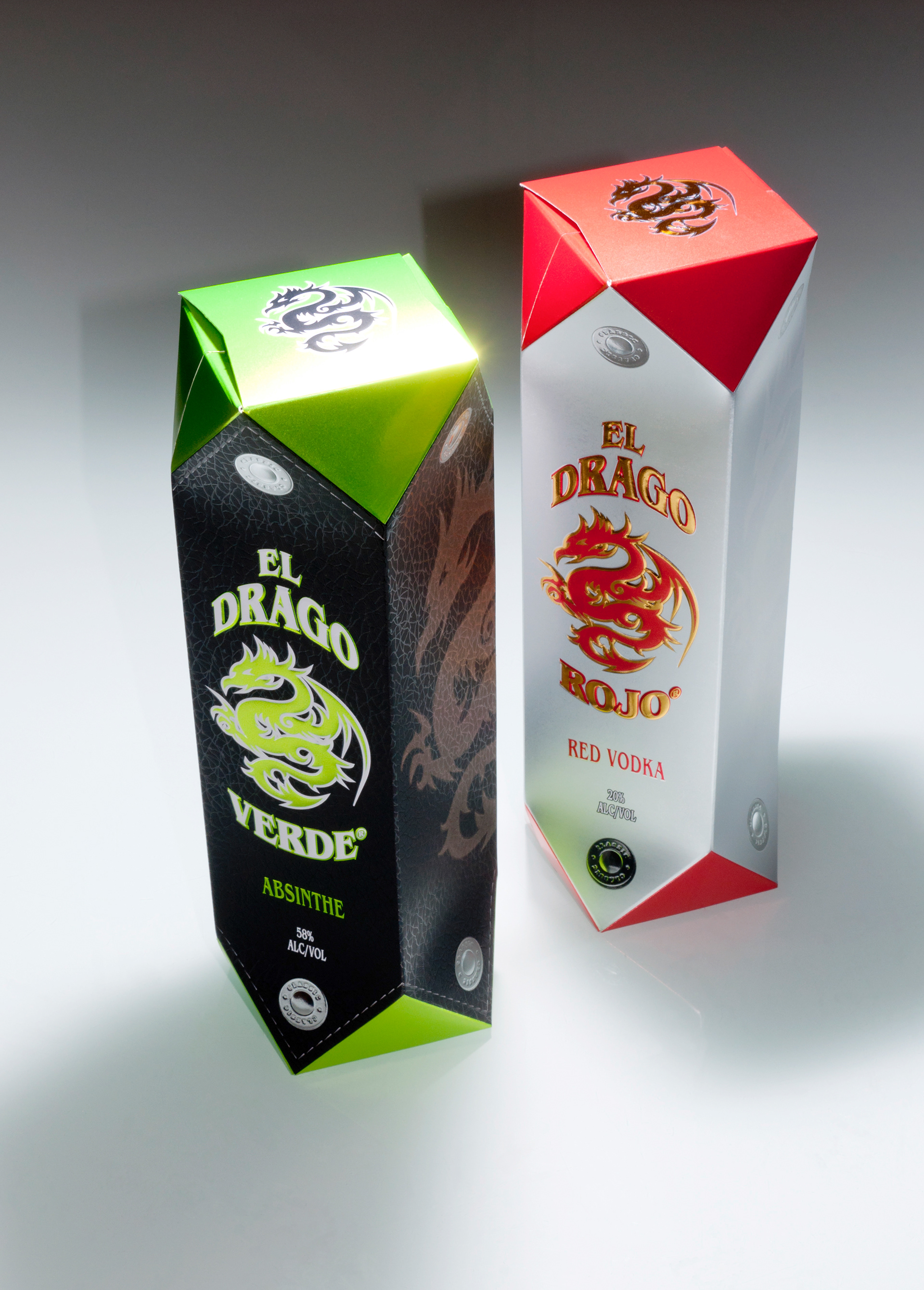

The luxury drinks packaging with label
Luxurious outer packagings for designer spirits with matching labels with extremely strong visual and tactile effects.
Again, two different designs were elaborated, later being produced together on mixed sheets by gravure printing.
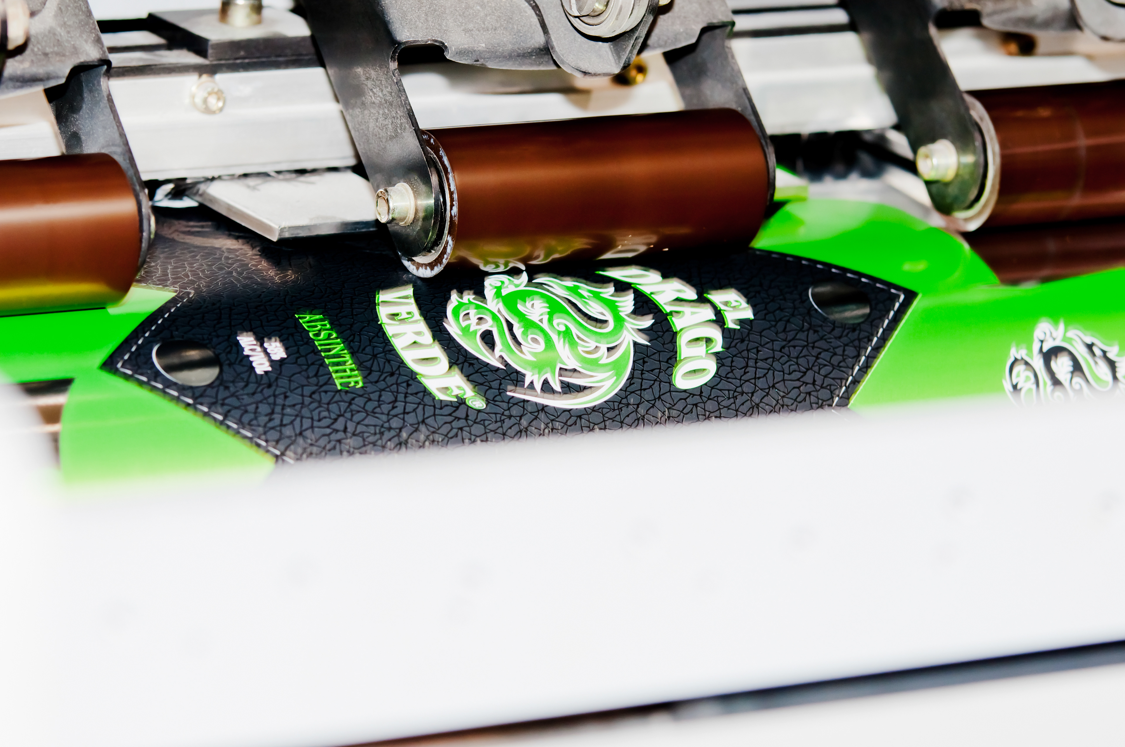
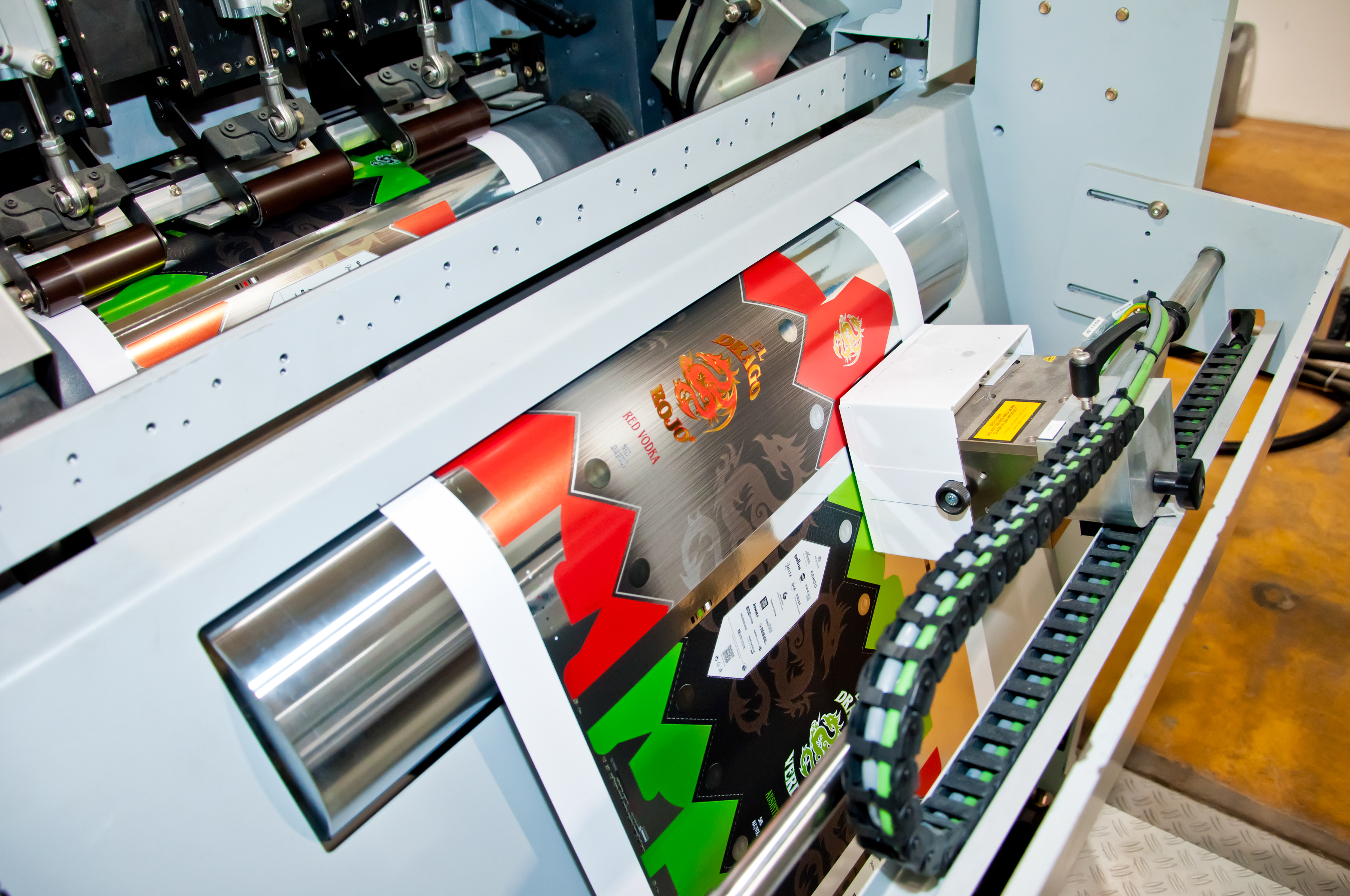
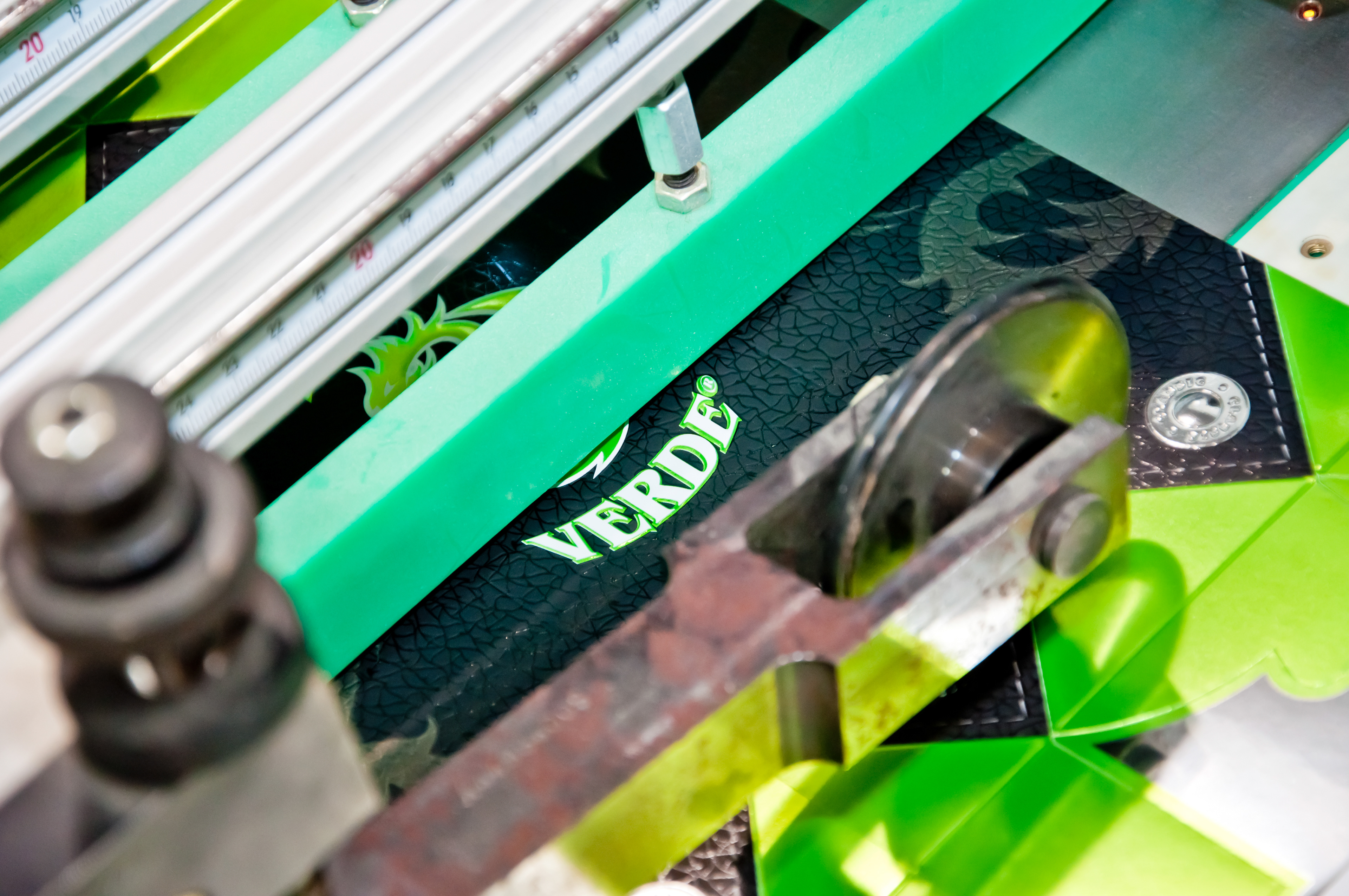
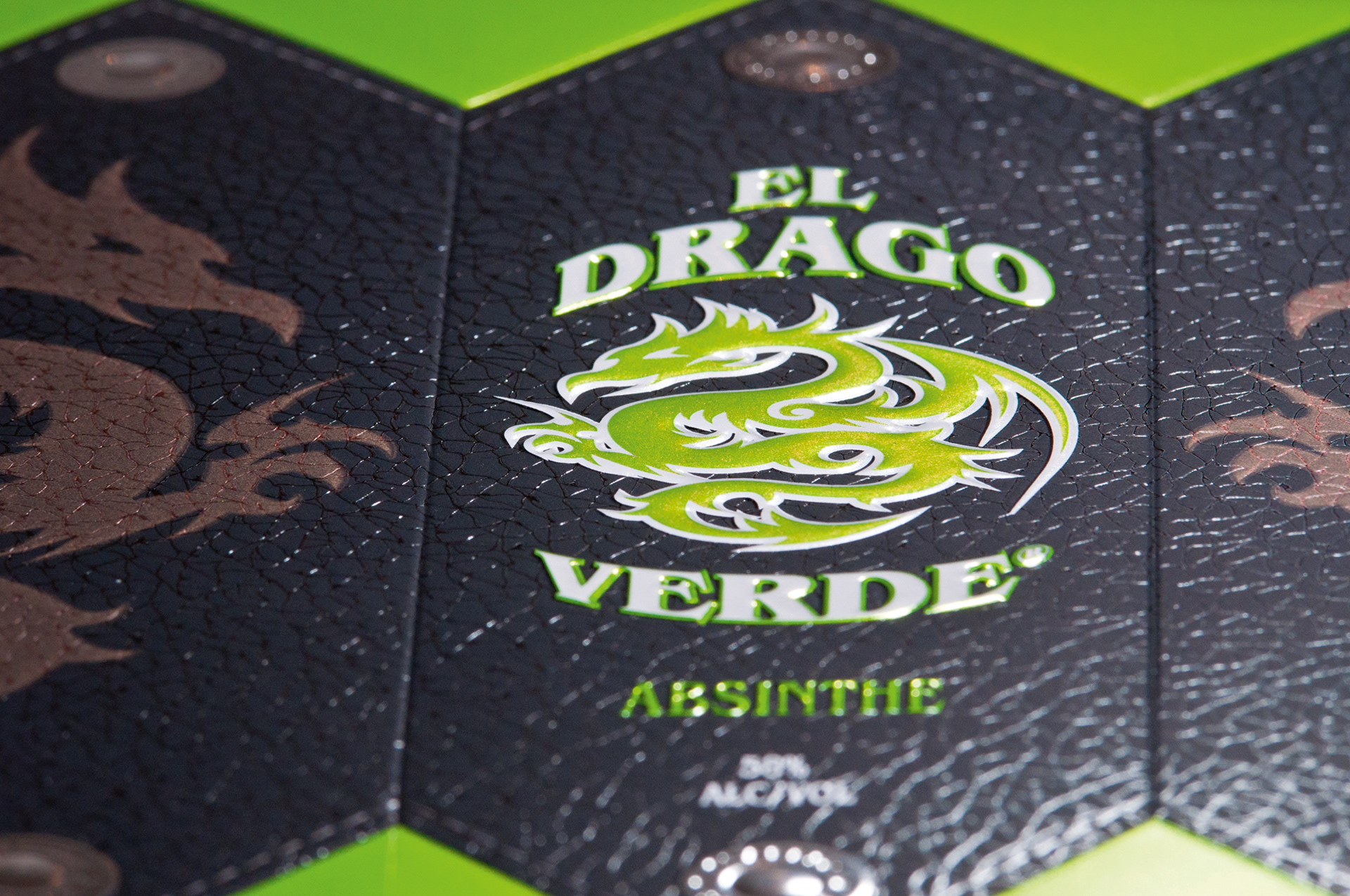
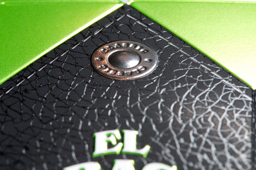
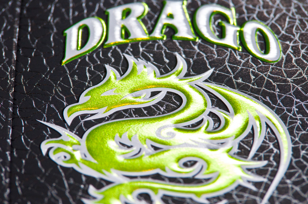
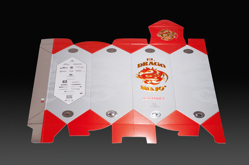
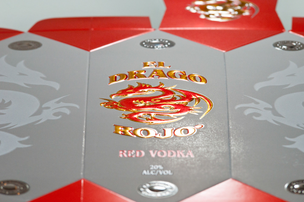
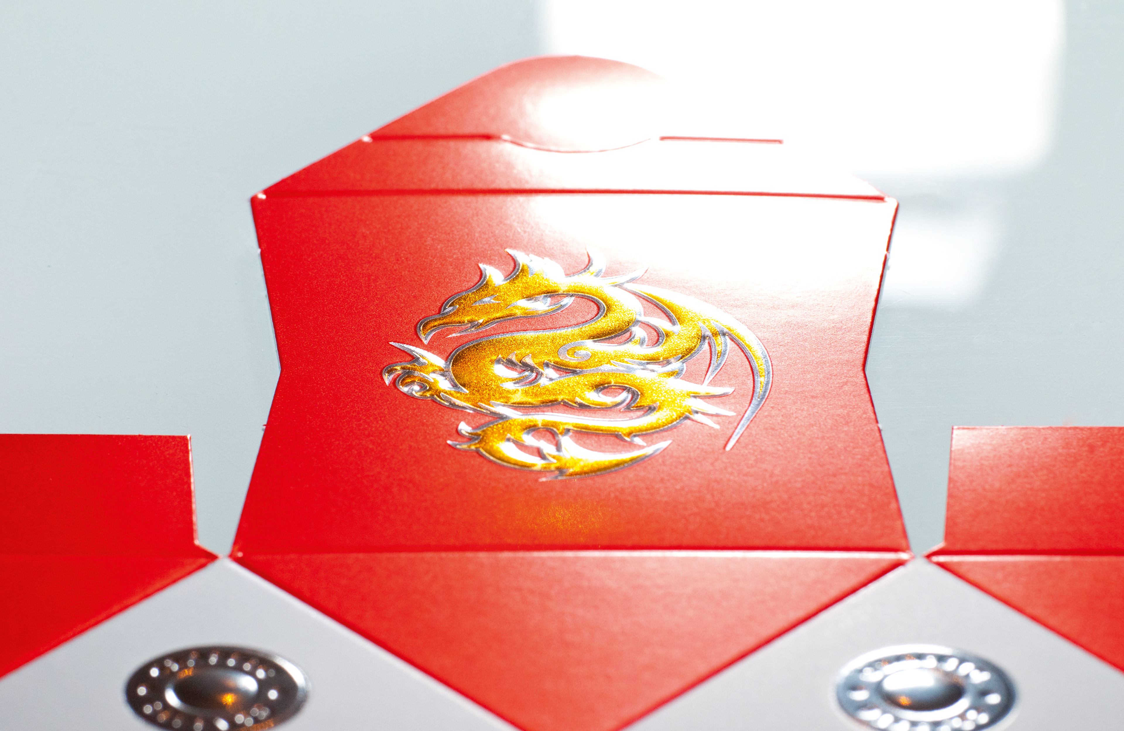
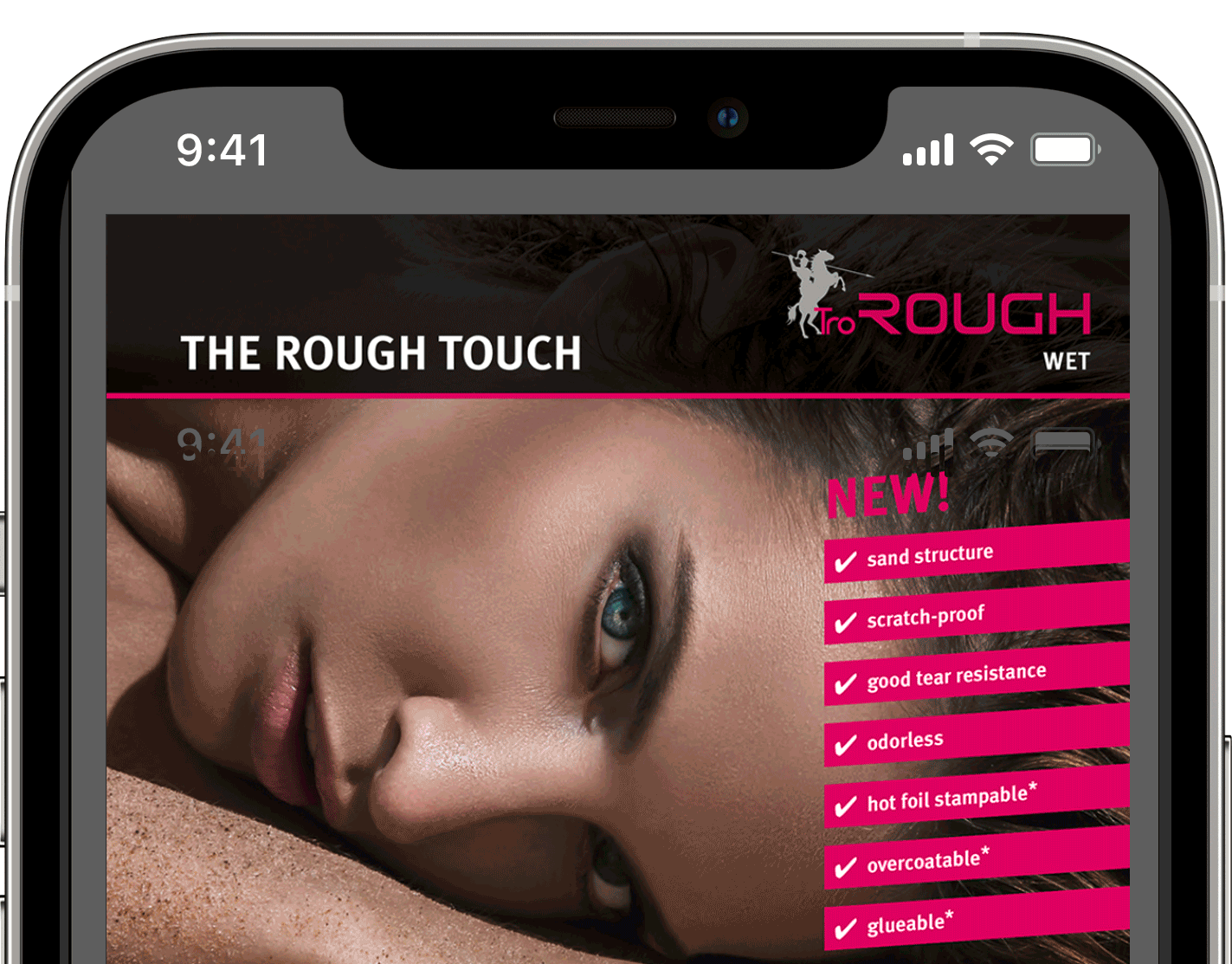
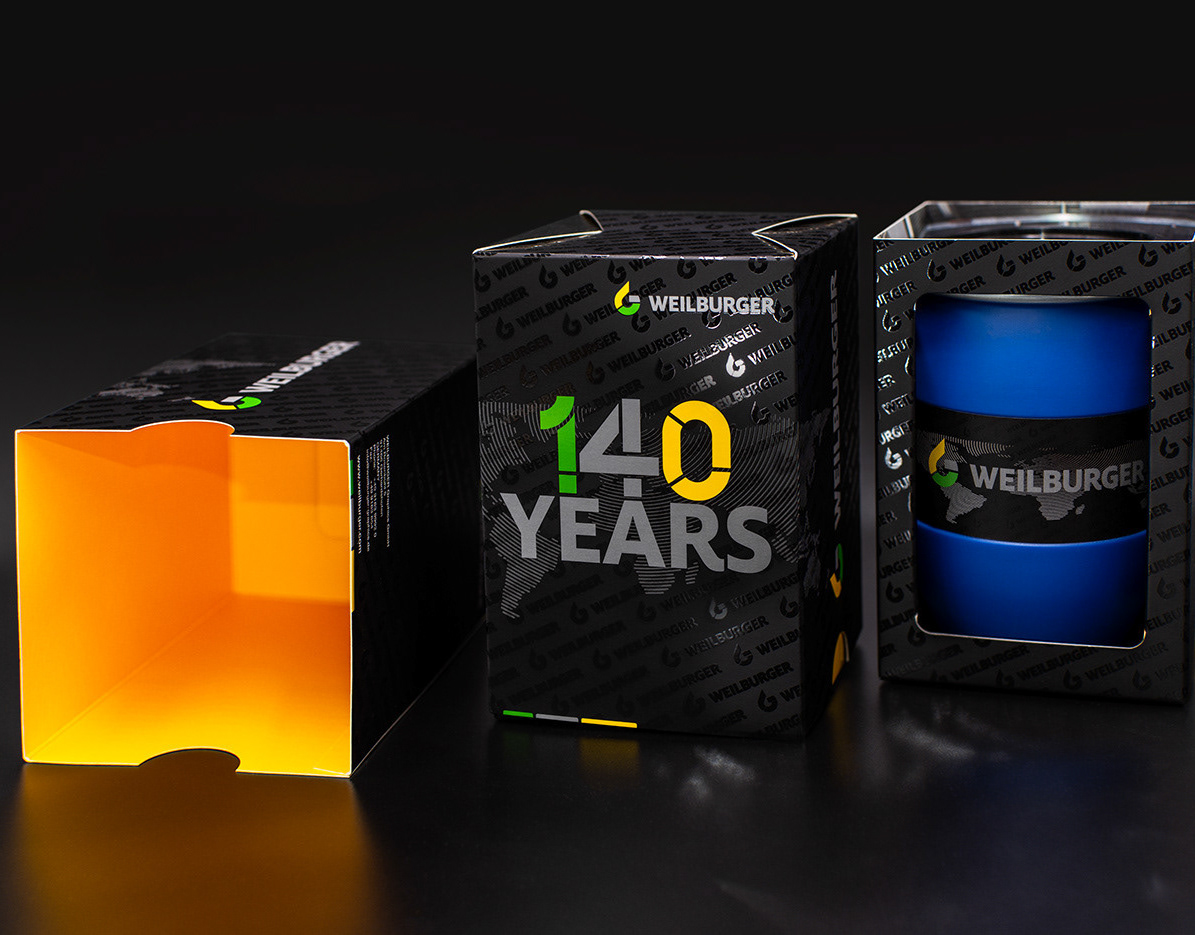
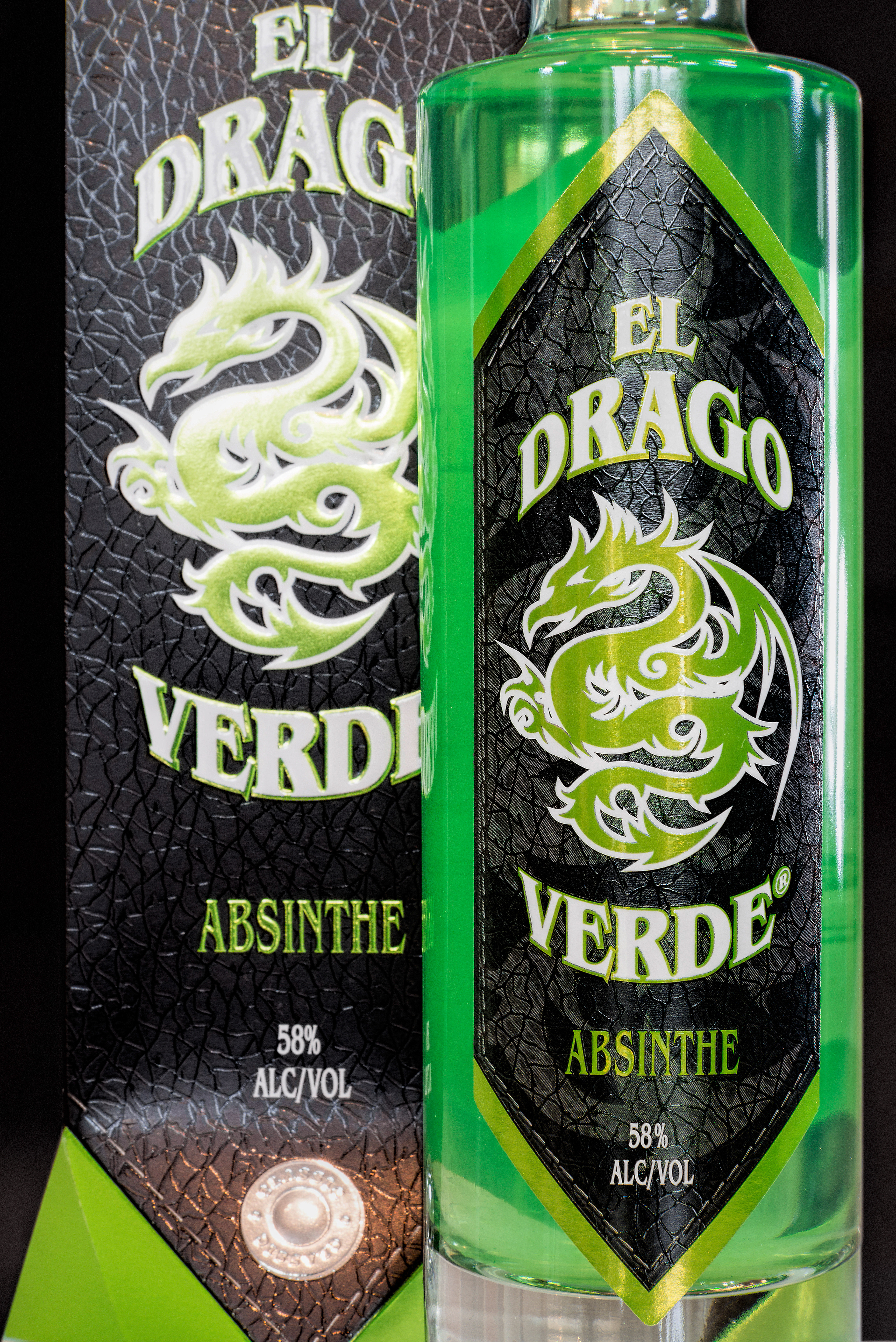
Materials and surfaces, such as leather, aluminum, chrome or gold, were reproduced as realistically as possible for the effects.
The packagings were then realized using a silver laminate, hot foil stamping, Colorstream®, glossy and haptic matt coatings, as well as rotary structure embossing, high-relief embossing and debossing.
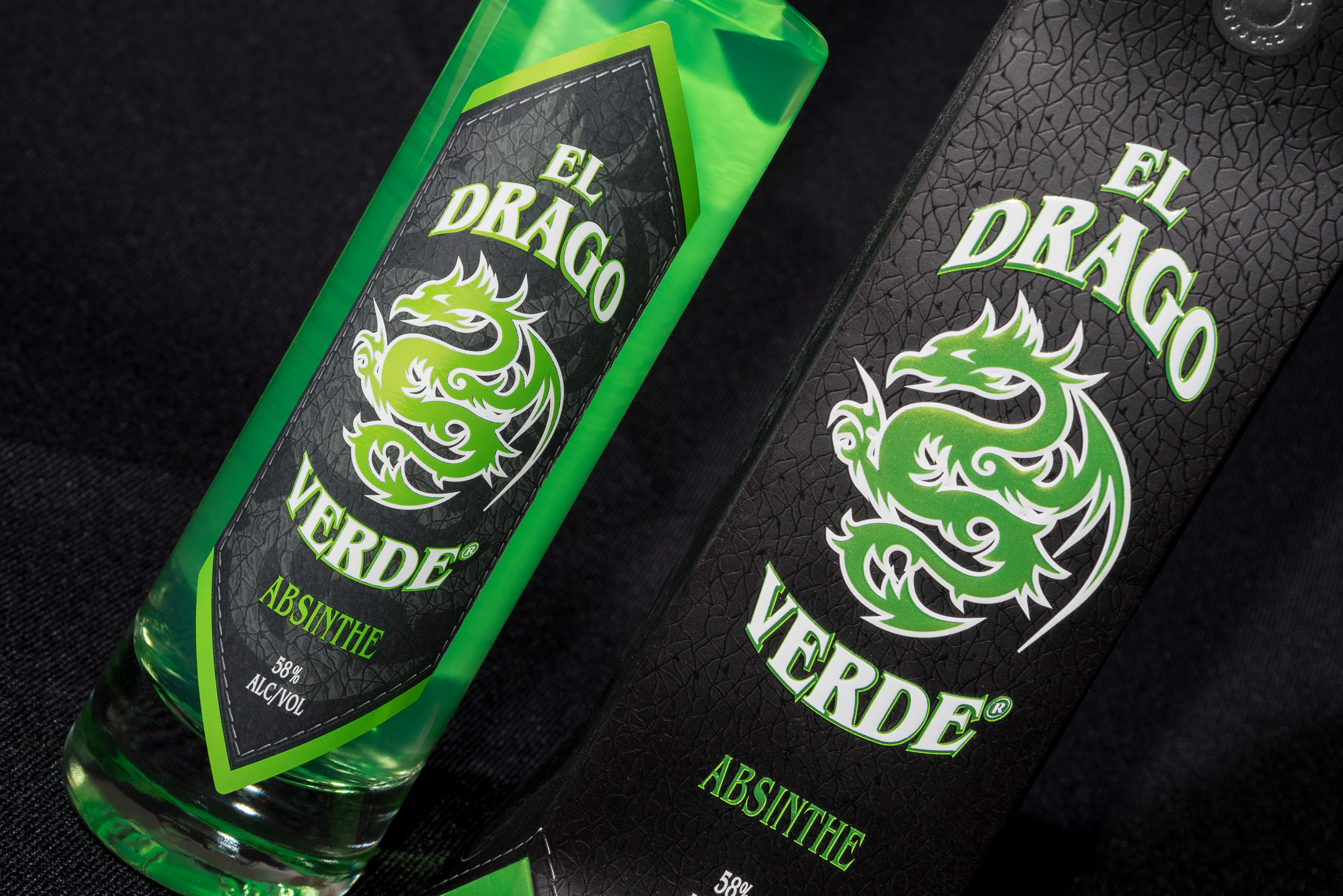
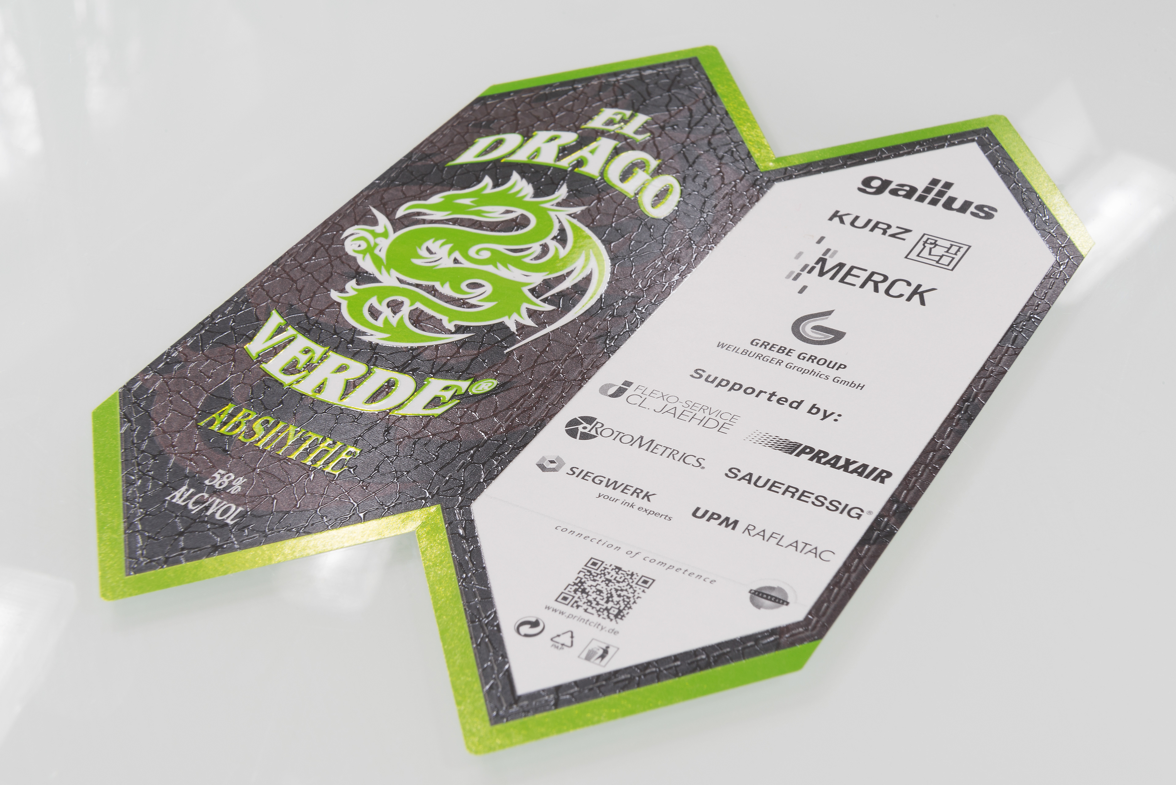
The optical and haptic effects on the labels are achieved by a skillful combination of cold foil, inks, pigments and coatings. The label for ‘El Drago Rojo‘ also incorporates the new Metallic Doming process, which creates the same visual and tactile effects as standard embossing processes by a sophisticated combination of screen printing and foil application.
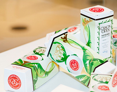
Shape, design and finishing: attracting attention at the POS
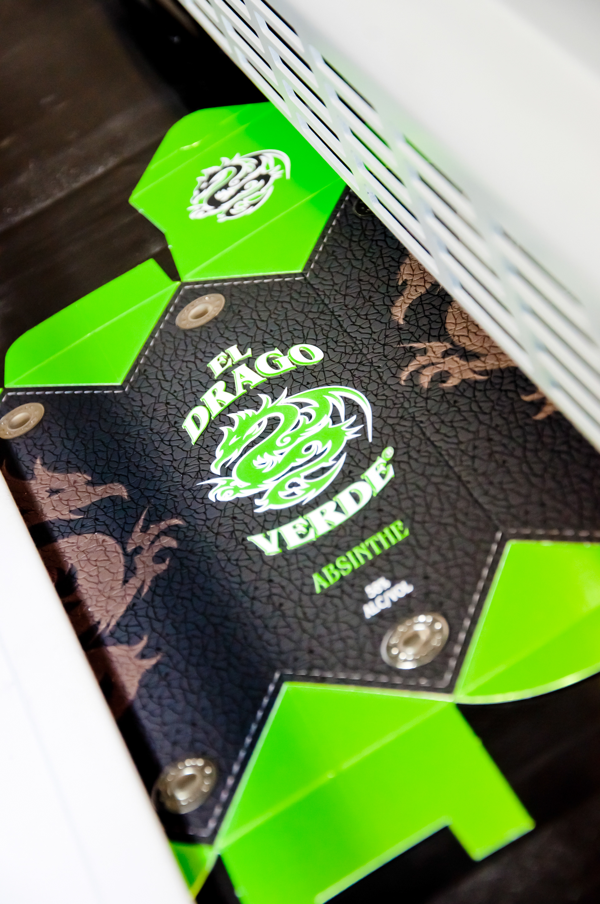
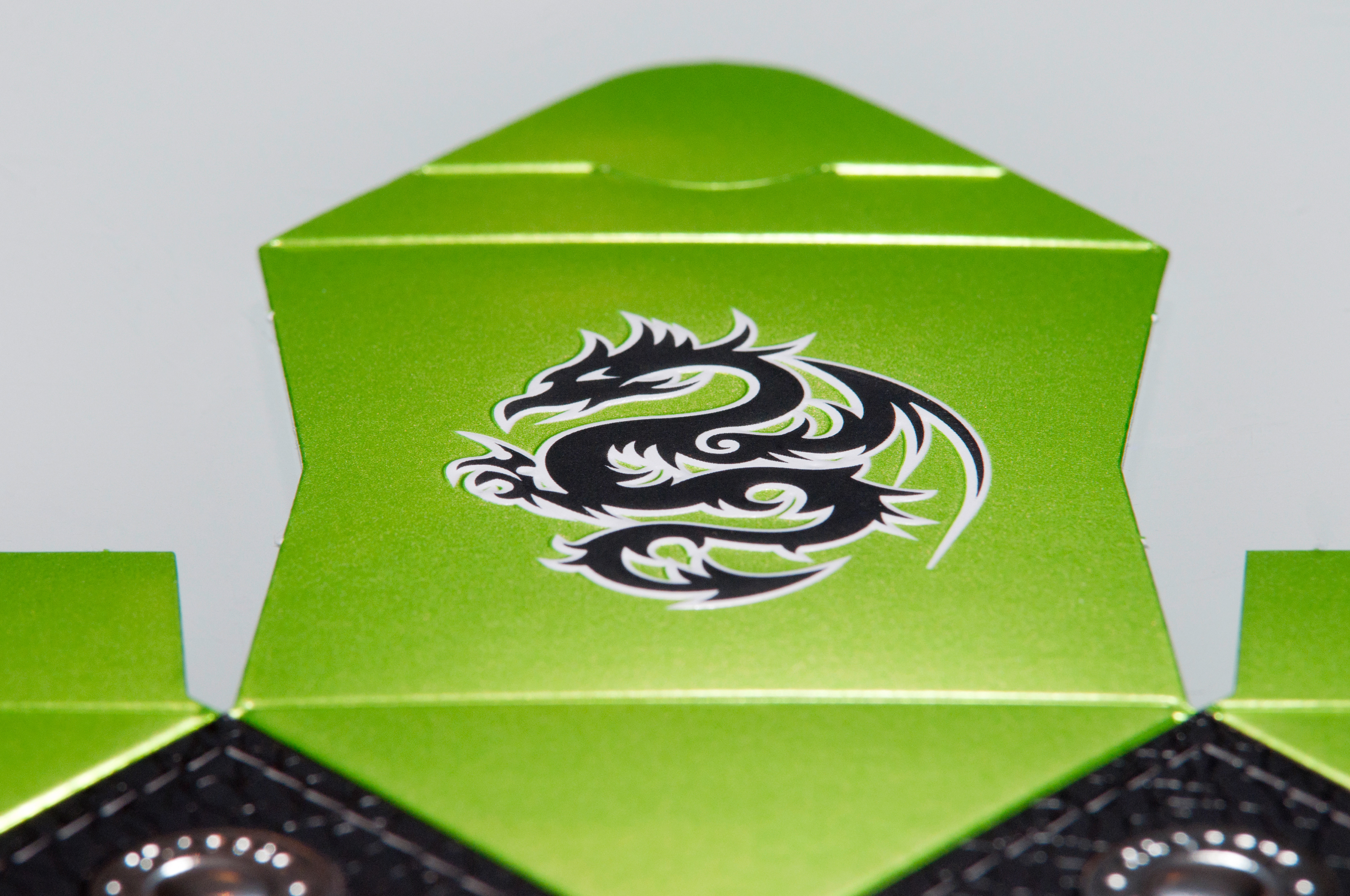
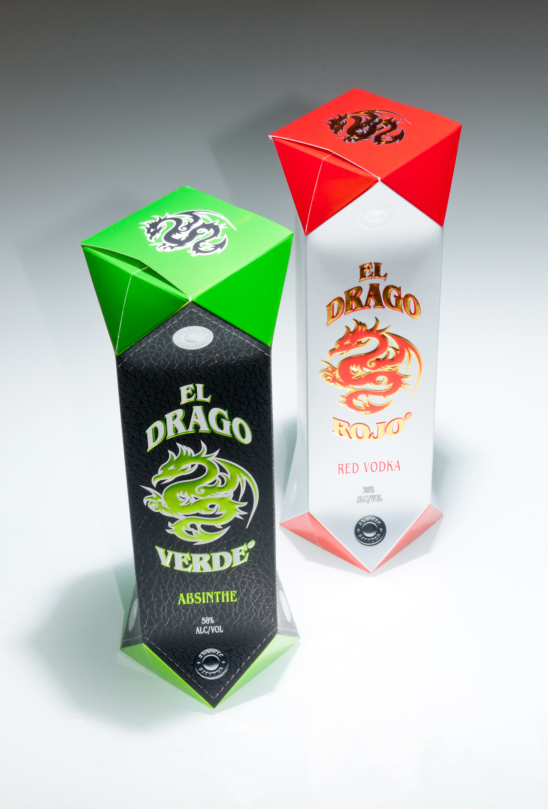
The first thing to hit the eye is the diamond shape of this packaging: a memorable shape with a very high recall value at the POS. This impression is intensified by the reflections brought about by precisely this shape: the play of the light differs from every angle, catching the customer‘s eye in what are usually overladen shelves.
The finishings are chosen to match the unusual shape – the special nature of the packaging is further underlined by its finishing. This creates a strong visual effect that stands out from many other packagings and tempts the customer to reach out and buy.
And that‘s where the story continues: the surface not only catches the eye, but also offers potential purchasers a positive experience when they touch it. When later unpacking, the brand experience is further intensified by labels with the same look and feel.
The whole thing is then rounded off by a simple mechanism for opening and reclosing. These are packagings that don‘t end up in the waste paper as soon as they‘ve been bought.
This perfect interplay of shape, design and finishing is the success factor at the
POS.
The realization of these packagings is exemplified on the basis of three selected market segments, with several design and finishing versions each – varied, realistic and inspiring!
A harmonious combination of high-quality finishings
The range of finishings used is wide. The focus when selecting them is on the impact on the customer and the image of the product that is to be conveyed. In addition to this, it is important to use the right materials: they need to be technically coordinated and must permit optimum processing in the production system.
This all starts with the quality of the substrate – the basis for the entire production process and the perfect end product. The inks, coatings, pigments, foils and tools are selected on the basis of the same high quality standards.
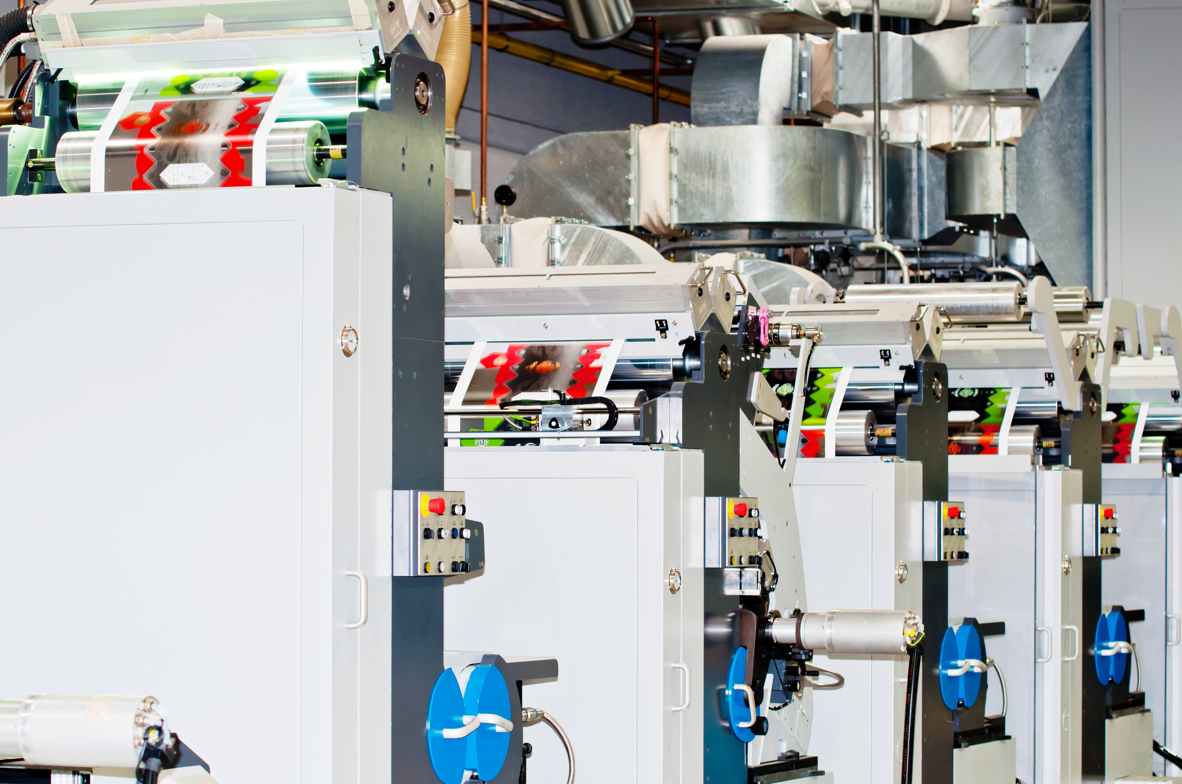
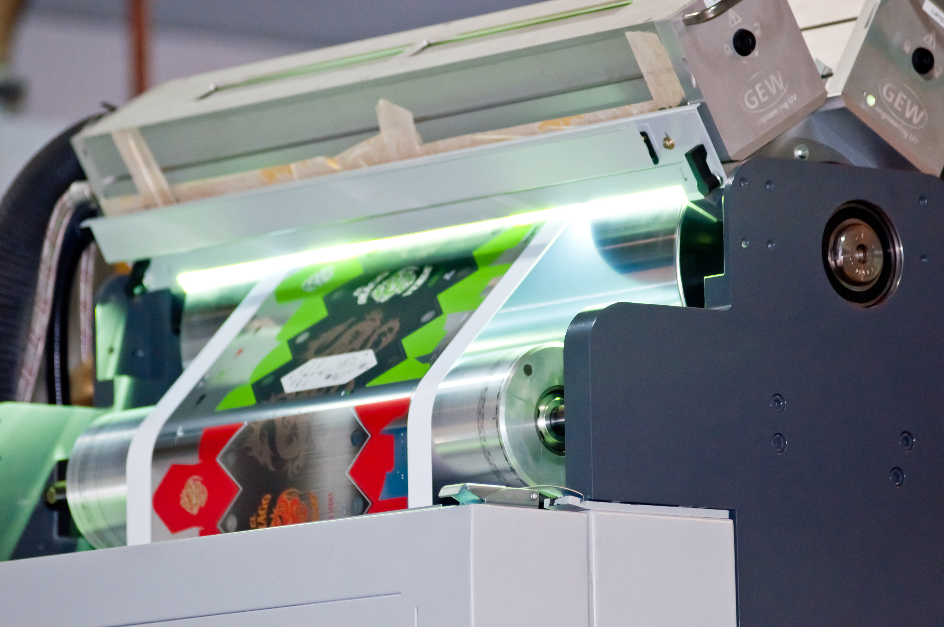
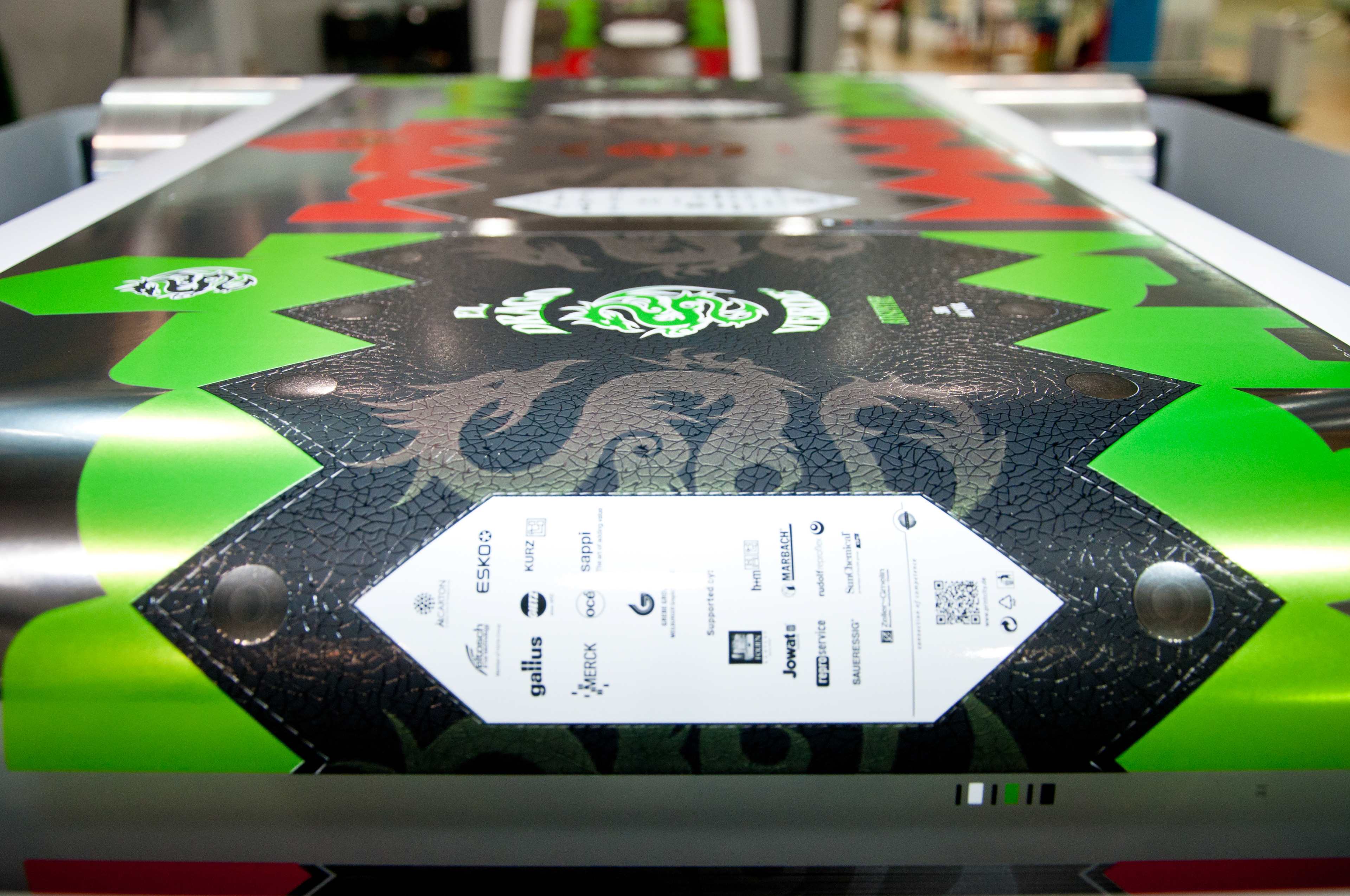
Inline production for profitable realization
The fact that such high-class packagings and labels are also profitable, is demonstrated by their realization by highly flexible and economical inline production using various printing and finishing techniques.
All samples were produced in a single cycle – from the roll to the die-cut and fully-finished carton with matching label. And it all starts with the skillful selection of the finishings and their coordination with the production system.
The logistics are also surprisingly simple for the manufacturer: despite the unusual shape, the cartons can be palletized in flat form after gluing, and remain crushproof and readily stackable after filling.
The holistic approach results in the creation of unusual, high-quality packagings and labels for a wide market.
All the experience gained in the project – from the design and the materials used, all the way to production – has been summarized in a Tutorial (also written by me).
Further information and tutorials: